How to Create an Instagram Aesthetic That Gets Followers


Your Instagram aesthetic is the first thing a new visitor sees — and it's often the deciding factor in whether they hit Follow. A cohesive feed signals intention, credibility, and quality. A scattered feed signals chaos. The difference isn't about perfection or expensive photography; it's about consistency in a few key visual elements.
In 2026, the definition of "aesthetic" has shifted. The ultra-curated, filtered-to-death grids of 2020 are out. What works now is authentic consistency — a recognizable visual identity that looks intentional without looking manufactured. This guide shows you how to build one.
TL;DR
- Your Instagram aesthetic is your visual brand identity: color palette + content types + editing style applied consistently.
- Pick 3–5 brand colors and stick to them across every post.
- Define 3–4 content pillars (recurring themes) so your grid has variety with cohesion.
- The 2026 trend is "authentic aesthetic" — consistent and recognizable, but not overly polished or filtered.
- Plan your grid in advance so individual posts make sense together.
Table of Contents
- What Is an Instagram Aesthetic (and Why It Matters)
- The 2026 Aesthetic Shift: Authentic Over Perfect
- How to Define Your Visual Identity
- Choosing Your Color Palette
- Content Pillars: The Structure Behind Variety
- Grid Planning: Making Posts Work Together
- Editing Consistency: Presets, Filters, and Style
- Typography and Text Overlays
- Instagram Aesthetic for Businesses vs. Creators
- Real Examples of Strong Instagram Aesthetics
- Common Aesthetic Mistakes
- FAQs
What Is an Instagram Aesthetic (and Why It Matters)
Your Instagram aesthetic is the overall look and feel of your profile when someone visits your grid. It's the combination of your color palette, content types, editing style, typography, and visual patterns. When done right, a visitor can scroll through your grid and instantly understand what your brand or personal brand is about — without reading a single caption.
Why it matters for growth
- First impressions drive follows. When someone discovers you through a Reel or Explore, they visit your profile. A cohesive grid makes them more likely to follow because it signals that you're intentional about your content. Learn more about what drives follows in our guide on how to get more Instagram followers.
- Brand recognition compounds. When your posts have a consistent visual identity, followers recognize your content in their feed before they read the username. Visual branding research shows that a consistent color palette increases brand recognition by up to 80%, and posts with branded visuals receive 650% more engagement than text-only content.
- The algorithm rewards engagement, and aesthetics drive saves. Visually appealing content gets saved more often, and saves are one of Instagram's strongest ranking signals. The algorithm now puts more weight on shares and saves than simple likes.
An aesthetic doesn't have to be rigid. It's a framework — a set of visual guidelines that make your content recognizable while leaving room for variety and authenticity. Track how your visual identity affects performance with our engagement rate calculator and compare against platform benchmarks.
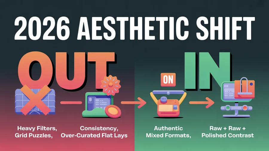
The 2026 Aesthetic Shift: Authentic Over Perfect
The Instagram aesthetic landscape has shifted dramatically. Here's what's changed:
What's out
- Heavy filters that make every photo look the same shade of orange or blue
- Ultra-curated "flat lay" perfection that feels staged and unrelatable
- Grid puzzles (splitting one image across 3, 6, or 9 posts) — they look clever but break the individual post experience
- Overly uniform color grading that sacrifices natural skin tones and product accuracy for "vibes"
What's in
- Authentic consistency — your feed looks intentional and cohesive, but individual posts feel real and unforced
- Muted, natural tones — soft color palettes that complement rather than overpower the content
- Mixed formats — carousels, Reels, quote graphics, and photos coexisting in a grid that still feels unified
- "Photo dump" aesthetics — curated casualness; posts that look effortless but follow a subtle visual logic
- Raw, behind-the-scenes content alongside polished posts — the contrast makes both feel more authentic
The accounts growing fastest in 2026 have a recognizable style without looking like they spent hours on every post. Think consistent mood rather than rigid template.
Plan your aesthetic in advance. PostEverywhere's content calendar lets you see your upcoming posts visually so you can ensure your grid looks cohesive before publishing.
How to Define Your Visual Identity
Before you touch a camera or editing app, define these three elements:
1. Brand keywords (3–5 words)
Pick 3–5 adjectives that describe the feeling you want your Instagram to evoke. These guide every visual decision.
Examples:
- A sustainable fashion brand: clean, earthy, warm, minimal, intentional
- A fitness creator: energetic, bold, raw, motivating, bright
- A SaaS company: modern, professional, approachable, clean, blue
- A food blogger: warm, inviting, rustic, vibrant, cozy
2. Your audience's visual expectations
What does your target audience already follow and engage with? Scroll through the top accounts in your niche and notice:
- What colors dominate their grids?
- Are photos bright or moody? Polished or raw?
- Do they use text overlays? What fonts?
You don't need to copy — but you need to fit into the visual neighborhood your audience expects while adding your own identity.
3. Your content formats
Decide which content types you'll regularly post:
- Photos (product, lifestyle, portrait)
- Carousels (educational, storytelling)
- Reels (short-form video)
- Quote graphics
- Behind-the-scenes / casual content
A grid that's 100% one format gets monotonous. Mixing 3–4 formats creates visual rhythm while maintaining cohesion through shared colors and editing style. For ideas on what to post, check our 50 Instagram Story ideas and 100 Instagram content ideas. To plan how much each format can hold, see our breakdown of how many photos you can post on Instagram.
Choosing Your Color Palette
Color is the most immediately recognizable element of your aesthetic. Research from HubSpot shows that color influences up to 90% of an initial impression and increases brand recognition by 80%. Pick a palette and commit to it.
How to build a palette
- Choose 1–2 primary colors that represent your brand. These will appear most frequently.
- Add 2–3 complementary/neutral colors that support your primaries without competing.
- Define an accent color for CTAs, highlights, and text overlays.
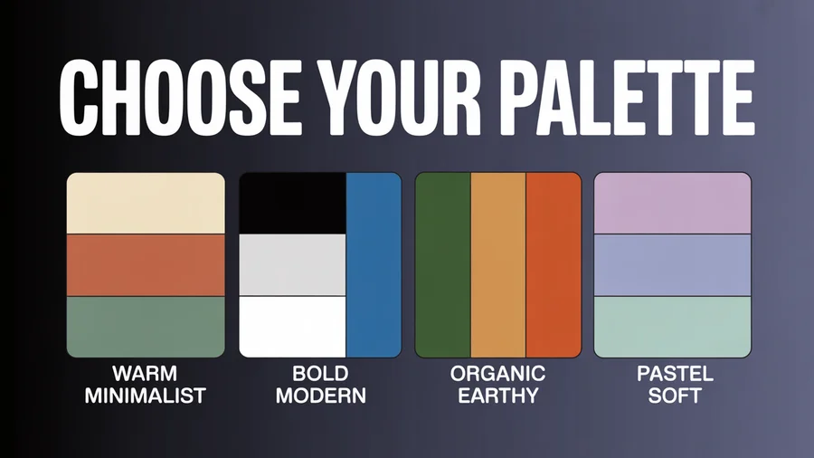
Palette examples
- Warm minimalist: Cream, terracotta, sage green, warm gray, white
- Bold and modern: Black, white, electric blue, coral accent
- Organic/earthy: Forest green, sand, burnt orange, off-white, brown
- Pastel soft: Lavender, blush pink, sky blue, mint, cream
Where your palette appears
- Background colors in graphics and carousels
- Clothing and props in photos (yes, plan for this)
- Text overlay colors
- Reel cover images
- Story highlight covers
- Profile photo border/background
Consistency doesn't mean every post is the same color. It means the same colors keep appearing across your grid, creating a recognizable visual thread.
Use our AI image generator to create on-brand visuals that match your palette.
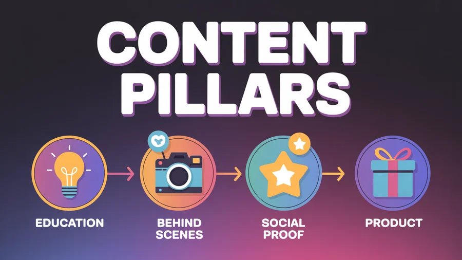
Content Pillars: The Structure Behind Variety
Content pillars are recurring themes or categories that make up your posting mix. They give your grid variety (different topics) with cohesion (all within your niche). Sprout Social's content pillar framework recommends building 3–5 repeatable themes around engagement, entertainment, and education.
How to define your pillars
Pick 3–4 pillars that map to your audience's interests and your business goals:
Example for a social media marketing brand:
- Tips and education — How-to carousels, strategy tips
- Behind the scenes — Team content, workspace, process
- Social proof — Customer results, testimonials, case studies
- Product — Feature highlights, tutorials, announcements
Example for a fitness creator:
- Workouts — Exercise demos, routines
- Nutrition — Meal prep, recipes, tips
- Motivation — Progress posts, mindset content
- Personal — Day-in-the-life, behind-the-scenes
How pillars create grid variety
If you post 4x/week with 4 pillars, each pillar gets one post per week. Your grid naturally alternates between content types, creating visual rhythm without requiring you to plan each post's position.
Assign a subtle visual cue to each pillar — a specific background color, text style, or layout — so followers can identify the content type at a glance.
Plan your pillar rotation in PostEverywhere's content calendar.
Grid Planning: Making Posts Work Together
Individual posts should look good on their own AND in the grid. This doesn't mean obsessing over every row of three — it means maintaining enough visual consistency that the overall grid feels intentional. Note that Instagram switched to a 4:5 vertical grid format in 2025, which affects how your posts appear on your profile — our Instagram aspect ratios guide walks through every ratio the grid now uses.
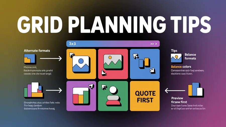
Practical grid planning tips
Alternate content formats. Don't post three text-heavy carousels in a row. Mix: photo, carousel, Reel, quote graphic.
Balance colors across the grid. If your palette includes terracotta, don't cluster all terracotta posts together. Space them out so the color appears rhythmically.
Keep negative space consistent. If your photos tend to be busy and detailed, balance them with cleaner, simpler posts (quote graphics, minimal product shots).
Use Reel covers intentionally. Reels can break your grid aesthetic if you use the default frame. Design custom cover images that match your palette and style.
Preview before publishing. Use a grid preview tool or PostEverywhere's calendar view to see how upcoming posts will look next to your recent ones.
Grid patterns (optional, not required)
Some accounts use deliberate patterns:
- Alternating — Light post, dark post, light post
- Row by row — Each row of three has a visual theme
- Diagonal — Similar post types fall on the same diagonal
These work well but are fragile — one unplanned post or deleted post breaks the pattern. Most successful accounts in 2026 rely on palette consistency rather than rigid patterns.
Editing Consistency: Presets, Filters, and Style
Consistent editing is the fastest way to make a random collection of photos look like a cohesive brand.
Creating your editing style
Choose one editing app and learn it well. Lightroom, VSCO, and Snapseed are the most popular for consistent presets.
Build or buy a preset that matches your brand keywords. A "warm and earthy" brand uses presets that boost warm tones and slightly desaturate greens. A "clean and modern" brand uses high-contrast, slightly cool presets.
Apply the same preset to every photo as a starting point, then adjust exposure and white balance per image. This creates consistency while allowing individual posts to look natural.
Avoid trend-chasing with filters. The "dark moody" look, the "orange and teal" look, the "film grain" look — these cycle in and out. Choose a style that matches your brand identity, not the current trend.
Video editing consistency
Reels and video content need visual consistency too:
- Use the same caption font and color across all videos
- Apply a consistent color grade or LUT
- Keep intro and outro patterns recognizable
- Maintain the same aspect ratio for cover images
Use our AI content generator to create on-brand caption variations for your posts. Find the right hashtags with our hashtag generator and track results with the engagement rate calculator.
Manage all your social accounts in one place. PostEverywhere handles Instagram, TikTok, LinkedIn, Facebook, YouTube, and X — so your aesthetic stays consistent everywhere. Start your free trial →
Typography and Text Overlays
If you use text on your posts — carousels, quote graphics, Reel covers — font choice matters.
Rules for Instagram typography
Pick 2 fonts maximum. One for headlines, one for body text. More than two creates visual chaos.
Use the same fonts everywhere. Carousels, Stories, Reel covers, and quote graphics should all use the same typography.
Ensure readability. Decorative fonts are hard to read on mobile screens. Clean sans-serif fonts (Inter, Montserrat, Poppins, Lato) work for body text. Bolder serif or display fonts work for headlines.
Size for mobile. Instagram is consumed on phones. Text needs to be large enough to read without zooming.
Color-match to your palette. Text overlays should use your brand colors, not random colors.
Keep your visual brand consistent across platforms. PostEverywhere lets you schedule Instagram, TikTok, LinkedIn, and more from one place — maintaining your aesthetic everywhere.
Instagram Aesthetic for Businesses vs. Creators
Business aesthetics
Business accounts benefit from a slightly more structured aesthetic:
- Product photography should be consistent in lighting, background, and styling
- Branded templates for carousels and announcements save time and reinforce identity
- Customer content (UGC) should be lightly edited to match your grid's overall tone
- Color consistency matters more for brand recognition — your target customer should recognize your post before reading the username
Creator aesthetics
Creator accounts have more flexibility:
- Personality is the brand — your face, style, and environment ARE the aesthetic
- Mixing personal and professional content is expected and humanizing
- Casual, "behind-the-scenes" content often outperforms polished posts
- Consistency in editing style matters more than rigid color palettes — your photos should look like they were taken by the same person, even if the subjects vary
The shared principle
Both need recognition at a glance. The test: if someone who follows you saw your post in their feed without reading the username, would they know it's yours? That's a strong aesthetic. Learn how to write a social media bio that reinforces your visual identity.
Real Examples of Strong Instagram Aesthetics
Glossier: Soft pink palette, clean product photography, lots of white space, user-generated content that still matches the brand's muted, minimal style.
Airbnb: Warm, inviting photography with consistent color grading. Mix of property photos, travel moments, and behind-the-scenes content that all feel like they belong to the same visual world.
Patagonia: Outdoor, earthy tones. Dramatic landscapes alongside advocacy content. The aesthetic is "nature first" — consistent in mood, not rigid in format.
Humans of New York: No color palette, no preset, no visual consistency in the traditional sense. But the format (portrait + story) is so consistent that it's instantly recognizable. Proof that "aesthetic" can be about format consistency rather than color.
Canva: Bold, bright colors with high contrast. Heavy use of branded templates across carousels and graphics. Corporate aesthetic done well — professional but not boring.
Each of these accounts has a different approach, but they share one thing: you'd recognize their content without seeing the username.
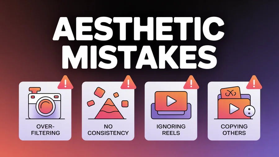
Common Aesthetic Mistakes
1. Over-filtering. Heavy filters that distort skin tones, product colors, or natural lighting damage trust. Especially for e-commerce — customers want to see accurate colors.
2. No visual consistency at all. Random filters, clashing colors, and wildly different editing styles make your grid look like a collage from multiple accounts.
3. Rigidity that kills content quality. Skipping a great piece of content because "it doesn't match my grid" is putting aesthetics above audience value. The aesthetic should serve your content, not the other way around.
4. Ignoring Reel covers. Reels default to a random frame from the video, which often breaks grid cohesion. Take 2 minutes to design a custom cover that matches your palette.
5. Copying another account's aesthetic exactly. Inspiration is fine; duplication isn't. Your aesthetic should reflect your brand identity, not someone else's.
6. Changing your aesthetic every month. Aesthetic shifts should be gradual and rare. Frequent changes prevent brand recognition from building. If you need a refresh, transition over 2–4 weeks by gradually introducing new elements.
7. Prioritizing grid over individual post quality. Each post appears independently in followers' feeds and in Explore. A post that looks great in the grid but mediocre on its own doesn't serve your growth.
8. Forgetting about Stories and Reels. Your aesthetic should extend to Stories (highlight covers, branded templates) and Reels (consistent captions, color grading, covers). The grid is only one part of your visual identity.
FAQs
Do I need a perfect Instagram grid to grow?
No. The ultra-curated grid era is over. What you need is recognizable visual consistency — a palette, editing style, and content mix that makes your account feel intentional. Followers care more about content value than pixel-perfect grids.
How do I create an aesthetic if I'm just starting?
Start with your 3–5 brand keywords, pick a color palette, choose one editing preset, and define 3–4 content pillars. Apply these to your first 9 posts and you'll have a cohesive grid foundation. Refine as you go based on what performs.
Should my Instagram aesthetic match my other platforms?
Core brand elements (colors, logo, fonts) should be consistent across platforms. But each platform has different norms — Instagram is more visual and curated, TikTok is raw and authentic, LinkedIn is professional. Adapt your visual style to fit each platform's culture while maintaining brand recognition.
How often should I change my aesthetic?
Rarely. A strong aesthetic needs time to build recognition. If a refresh is needed (rebrand, new direction), transition gradually over 2–4 weeks. Sudden changes confuse followers and break the visual consistency you've built. Check our guide on how often to post on social media for cadence recommendations.
Does Instagram aesthetic matter for Reels?
Yes — Reels appear in your grid, in the Reels tab, and in Explore. Consistent Reel covers, caption fonts, and color grading extend your aesthetic to video. Since Reels get the highest reach of any Instagram format, they're actually the most important format to keep on-brand.
Can I have an aesthetic without professional photography?
Absolutely. Phone photography with consistent editing (one preset, one style) creates a stronger aesthetic than professionally shot photos with random editing. The consistency matters more than the camera. Use our AI image generator for on-brand visuals and write a compelling social media bio to complete your profile.
What tools help with grid planning?
Use PostEverywhere's content calendar to preview how upcoming posts will look alongside your recent content. For dedicated grid planning, see our Planoly alternatives guide — several tools offer visual feed previews. For design, Canva and our AI image generator help create on-brand graphics. For photo editing, Lightroom presets create consistency across your images.
How does an aesthetic affect the Instagram algorithm?
Indirectly but significantly. A strong aesthetic drives more saves (users save visually appealing content), more profile visits (cohesive grids convert visitors to followers), and more brand recognition (followers engage more with content they recognize). Saves are one of Instagram's strongest ranking signals.
The Bottom Line
An Instagram aesthetic isn't about perfection — it's about recognition. Pick a color palette, define your content pillars, choose one editing style, and apply them consistently. Let your grid evolve naturally within that framework rather than forcing rigid patterns.
Plan your posts in PostEverywhere's content calendar, schedule them with the Instagram scheduler, and post at the best times for your audience. Track your performance with our engagement rate calculator and use the hashtag generator to maximize discoverability. The accounts that grow in 2026 aren't the most polished — they're the most recognizable and consistent.
Founder & CEO of PostEverywhere. Writing about social media strategy, publishing workflows, and analytics that help brands grow faster.